As you may have noticed we have changed our landing page and logo.
During the past 8 months we (Flat and the team) have earned maturity and confidence in what we aim to create. It's time to display a website design tailored to our vision!
What are we currently doing?
This summer is a great opportunity to take a step back regarding our execution. How it should go hand in hand with our vision.
Day after day we keep improving our skills on:
- music theory
- collaboration
- digital formats
- education needs
By starting to master each of these key points we've been able to create a simpler way to write music. However this is just the beginning - I may ramble here but there is still so much to do!
This is why we felt the need to improve our landing page! To show that we're not a project anymore: we're a solid and driven team, building up a great product to change the way people write music!
What do we want to convey?
Our main goal is to convey our desire to change the way people write music.
The feelings we target are:
- easiness
- freshness
- social
- collaborative
- love
Moreover we aim to create a real gap with the existing sheet music software logos. Most of them tend to focus on clef and are really complicated to memorise.
Easiness starts directly with the design of the logo and this is why we moved from:
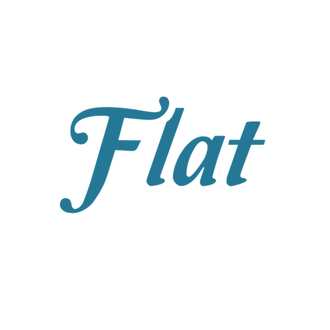
To
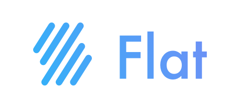
A big change isn't it? :)
What do we want to build?
From our point of view, creating a simpler way to write music isn't enough. Existing sheet music softwares have to adapt and focus on what really matters:
Composing music
Indeed, today there is only one way to write music: you first have to know music theory well enough to be able to create a draft. Then you need to have enough free time to write it all. This is such an annoying process.
We aim to break those rules and provide anyone with the opportunity to compose quickly no matter his/her music knowledge background!
New landing page
All these points have to be clearly displayed on the home page. In fact the home page itself has to be clear and pretty straight forward.
This is why we moved from:
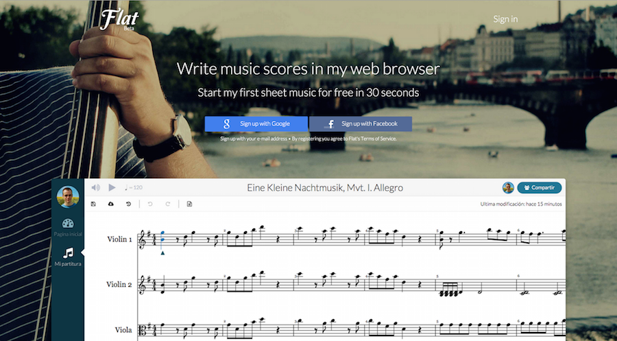
To:
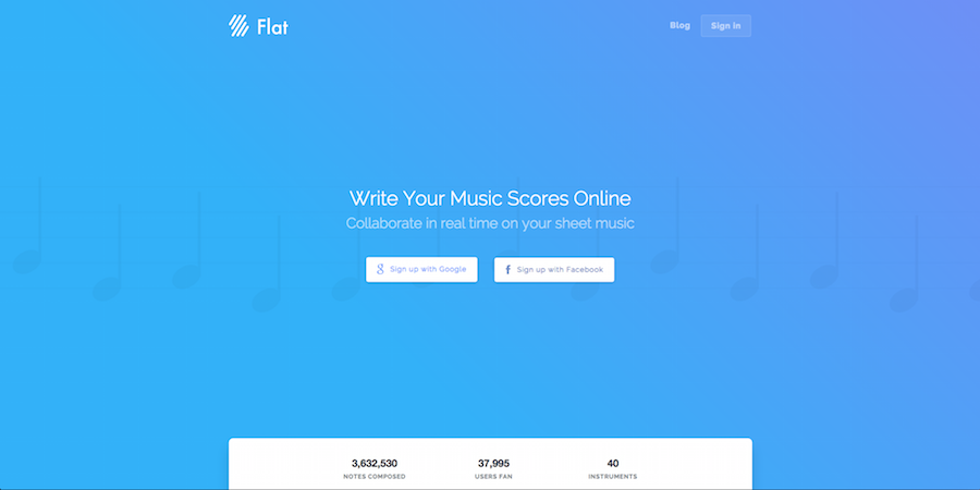
What do you think about it?
All these changes and improvements have been made by @Madgraphism.
If you like his work feel free to send him a message ;)
This is just the beginning!
Changing the landing page is good. Improving the overall experience on Flat according to our aim is another matter.
And as Mathias said:
Working on Flat UX is a real challenge
You like what we started and what we intend to create?
Feel free to share this article, it will mean the world to us!
With love,
Pierre
